Style Guide Code Snippets
When trying to include the following content into your side, please use the following guide to assist you with structuring and styling content on a page within the AODA Drupal Theme. Many of the recommended code snippets are from the Bootstrap Framework. Visit Bootstrap CSS for a full list of CSS classes. Please note that a majority of the following information requires a high level of technical understanding and general knowledge of web development.
- Buttons
- Images
- Slideshows
- Templates
- Miscellaneous
Buttons
The following code snippets demonstrate the style classes you would use to style a button or a link so that it looks like a button. You can control the colour and size of each button. 
Button vs Link?
If clicking the button causes the user to go to a different page, use a link.
<a href="#" class="btn btn-default">Link styled as a button</a>
If clicking the button triggers a change on the page (but does not go to a different page), use a button.
<button class="btn btn-default">Button that causes a change on the current page</button>
Bootstrap Button Colours
Default / White
<!-- Standard button style -->
<button type="button" class="btn btn-default">Default</button>
<a href="#" class="btn btn-default">Default</a>
Primary / Blue

<!-- Identifies the primary action in a set of buttons -->
<button type="button" class="btn btn-primary">Primary</button>
<a href="#" class="btn btn-primary">Primary</a>
Success / Green

<!-- Indicates a successful or positive action -->
<button type="button" class="btn btn-success">Success</button>
<a href="#" class="btn btn-success">Success</a>
Info / Grey

<!-- Contextual button for informational alert messages -->
<button type="button" class="btn btn-info">Info</button>
<a href="#" class="btn btn-info">Info</a>
Warning / Orange

<!-- Indicates caution should be taken with this action -->
<button type="button" class="btn btn-warning">Warning</button>
<a href="#" class="btn btn-warning">Warning</a>
Danger / Red

<!-- Indicates a dangerous or potentially negative action -->
<button type="button" class="btn btn-danger">Danger</button>
<a href="#" class="btn btn-danger">Danger</a>
Bootstrap Button Sizes
Large

<!-- Large button: This can be done with any of the aforementioned colours  -->
<button type="button" class="btn btn-default btn-lg">Large</button>
<a href="#" class="btn btn-default btn-lg">Large</a>
Small

<!-- Smallbutton: This can be done with any of the aforementioned colours  -->
<button type="button" class="btn btn-default btn-sm">Small</button>
<a href="#" class="btn btn-default btn-sm">Small</a>
Full Width

<!-- Full Width Button: This can be done with any of the aforementioned colours  -->
<button type="button" class="btn btn-default btn-block">Full-width button</button>
<a href="#" class="btn btn-default btn-block">Full-width button</a>
Expanding and Collapsing Buttons
The following code snippets demonstrates a button toggle that will show or hide the section of text below it. Replace 'uniqueNameForControl' with a unique name for the code snippet. Every time you use this snippet on a page, you will need to provide a different 'uniqueNameForControl' for that particular code snippet (eg. uniqueName1, uniqueName2, uniqueName3, etc.).
<h2><button aria-controls="uniqueNameForControl" aria-expanded="false" class="btn btn-primary" data-target="#uniqueNameForControl" data-toggle="collapse" type="button">More Info about Expandable Section</button></h2>
<div aria-expanded="false" class="collapse" id="uniqueNameForControl" role="region">
   <p>Content that will be shown or hidden using the button</p>
</div>

<h2><button aria-controls="uniqueNameForControl2" aria-expanded="false" class="btn btn-primary" data-target="#uniqueNameForControl2" data-toggle="collapse" type="button">More Info about Expandable Section</button></h2>
<div aria-expanded="false" class="collapse" id="uniqueNameForControl2" role="region">
   <p>Content that will be shown or hidden using the button</p>
</div>
Images
Rounded Images
This demonstrates an image with rounded corners using the img-rounded class.
<img src="/link/to/image" class="img-responsive img-rounded" />
This demonstrates an image with rounded square corners and a border using the img-thumbnail class.
<img src="/link/to/image" class="img-responsive img-thumbnail" />
This demonstrates a circular image using the img-circle class.
<img src="/link/to/image" class="img-responsive img-circle" />
Aligning Images
Centering Images
Avoid using <center> to center images on the page. Instead, use the "center-block" class.
<img src="..." class="img-responsive center-block" alt="Descriptive alt text" />
Floating Images Left
Use the "pull-left" or "pull-right" classes to float images left or right.
<img src="..." class="img-responsive pull-left" alt="Descriptive alt text" />
Floating Images Right
<img src="..." class="img-responsive pull-right" alt="Descriptive alt text" />
Clearing Floated Images
To clear a float, you can put a "clearfix" class on the parent element.
<div class="clearfix"><img src="..." class="img-responsive pull-right" alt="Descriptive alt text" /></div>
Images with Captions
Use the following code to add a formatted caption to your image
<figure class="thumbnail">
    <img alt="" class="img-responsive img-rounded" src="/src/for/your/image" />
    <figcaption class="caption">Your caption text here</figcaption>
</figure>
Note: the img-rounded class is optional. The code above will provide the following effect:

By default, the border expands to fill available width in the area where the image has been placed. If you don't want that much white space on either side, you can either use a larger image or apply the pull-left or pull-right class to figure like so:
<figure class="thumbnail pull-right">
This will give you the following effect instead:

Creating a Responsive Image Grid with Bootstrap
2 Column Responsive Image Grid
Use the following code to create one row of a 2 column grid. Repeat for as many rows as you need. Remember to replace each img element with a decorative image that relates to the associated text link.
<div class="row">
   <div class="col-md-6 col-lg-6 col-xs-12 col-sm-6">
      <figure class="thumbnail">
         <img alt="" class="img-responsive center-block img-rounded" src="/src/for/your/image" />
         <figcaption class="caption"><a href="#">Name of Link 1</a></figcaption>
      </figure>
   </div>

   <div class="col-md-6 col-lg-6 col-xs-12 col-sm-6">
      <figure class="thumbnail">
         <img alt="" class="img-responsive center-block img-rounded" src="/src/for/your/image" />
         <figcaption class="caption"><a href="#">Name of Link 2</a></figcaption>
      </figure>
   </div>
</div>

3 Column Responsive Image Grid
Use the following code to create one row of a 3 column grid. Repeat for as many rows as you need. Remember to replace each img element with a decorative image that relates to the associated text link.
<div class="row">
   <div class="col-md-4 col-lg-4 col-xs-12 col-sm-4">
      <figure class="thumbnail">
         <img alt="" class="img-responsive center-block img-rounded" src="/src/for/your/image" />
         <figcaption class="caption"><a href="#">Name of Link 1</a></figcaption>
      </figure>
   </div>

   <div class="col-md-4 col-lg-4 col-xs-12 col-sm-4">
      <figure class="thumbnail">
         <img alt="" class="img-responsive center-block img-rounded" src="/src/for/your/image" />
         <figcaption class="caption"><a href="#">Name of Link 2</a></figcaption>
      </figure>
   </div>

   <div class="col-md-4 col-lg-4 col-xs-12 col-sm-4">
      <figure class="thumbnail">
         <img alt="" class="img-responsive center-block img-rounded" src="/src/for/your/image" />
         <figcaption class="caption"><a href="#">Name of Link 3</a></figcaption>
      </figure>
   </div>
</div>
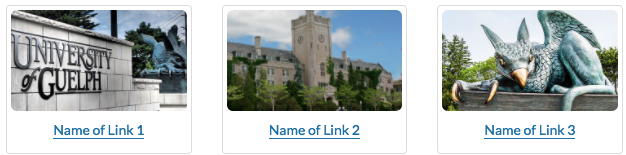
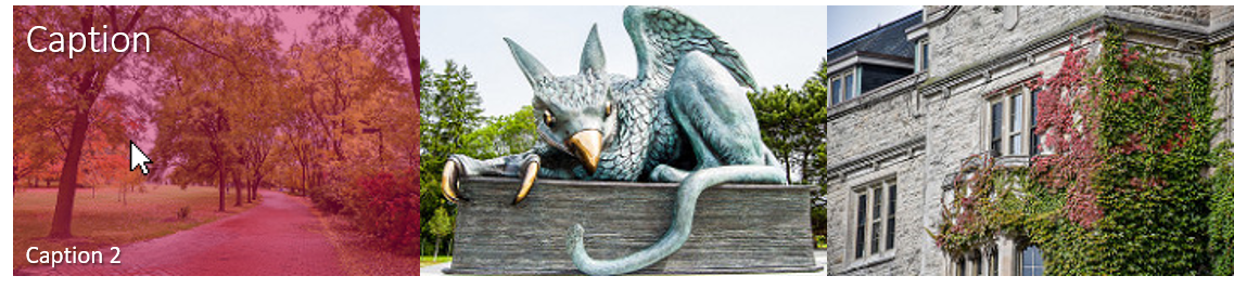
Image Overlay
Image Overlay with Single Heading Caption
The following code snippet demonstrates the method you would use to create a linked image with a clickable colour overlay. This overlay also features a caption when hovered over.
Make sure that the Text Format is switched to Full HTML rather than the default Filtered HTML.
<div class="img-overlay ug-gold">
<a href="/your/link/here">
  <img alt="Your text here. If it's identical to your caption text, you can leave the alt text empty" src="/your/image/here.jpg" />
  <span class="overlay-caption h3">Your caption text here</span></a>
</div>


The defualt overlay colour is black. To change this colour, input div class="img-overlay ug-gold"in place of div class="img-overlay" Colour options include: ug-gold ug red ug blue
If your desired alt text is the same as your caption text, you can choose to leave the alt text empty. Otherwise, alt text is required If your image was uploaded with text overlaying the image, alt text is also required.
Image Overlay with Two Captions
You can create a similar image overlay - but with additional text. This overlay will have a heading caption along the top of the image and a second, smaller caption along the bottom.
This can be done with any of the aforementioned colours.
<div class="img-overlay ug-red">
<a href="/your/link/here">
  <img alt="Your alt text here. If it's identical to your caption text, you can leave the alt text empty" src="/your/image/here.jpg" />
  <span class="overlay-caption h3">Your caption text here</span>
  <span class="overlay-text">Your extra text here</span>
</a>
</div>
Slideshows
The code below previously contained the code <div class="carousel-inner" role="listbox"> but now role="listbox" is removed so as to make the slideshow accessible. If you had the previous code please remove the role="listbox" from the code.
Use the following code to create an inline paginated slideshow.
<div class="carousel slide" data-interval="false" data-keyboard="true" data-wrap="false" id="carousel-name">

    <div class="carousel-table">
        <a class="glyphicon glyphicon-chevron-left" data-slide="prev" href="#carousel-name" role="button"><span class="sr-only">Previous slide</span></a>

        <ul class="carousel-indicators pagination">
            <li class="active"><a data-slide-to="0" data-target="#carousel-name" href="#">1</a></li>
            <li><a data-slide-to="1" data-target="#carousel-name" href="#">2</a></li>
            <li><a data-slide-to="2" data-target="#carousel-name" href="#">3</a></li>
        </ul>
        <a class="glyphicon glyphicon-chevron-right" data-slide="next" href="#carousel-name" role="button"><span class="sr-only">Next slide</span></a>
    </div>

    <div class="carousel-inner">
        <div class="item active"><img alt="Alt text for first image. " class="img-responsive img-rounded" src="...">
            <h2>Heading for the first slide</h2>
            <p>Text for the first slide</p>
        </div>

        <div class="item"><img alt="Alt text for second image." class="img-responsive img-rounded" src="...">
            <h2>Heading for the second slide</h2>
            <p>Text for the second slide</p>
        </div>

        <div class="item"><img alt="Alt text for third image." class="img-responsive img-rounded" src="...">
            <h2>Heading for the third slide</h2>
            <p>Text for the third slide</p>
        </div>
    </div>
</div>

Templates
Two Columned List
This code snippet demonstrates the method you would use to create a list with two columns.
<div class="row">
    <div class="col-sm-4">
        <ul>
            <li>Column 1 List Item 1</li>
            <li>Column 1 List Item 2</li>
            <li>Column 1 List Item 3</li>
        </ul>
    </div>

    <div class="col-sm-4">
        <ul>
            <li>Column 2 List Item 1</li>
            <li>Column 2 List Item 2</li>
            <li>Column 2 List Item 3</li>
        </ul>
    </div>
</div>

Listing Text Content with a Left-Aligned Image
This code snippet demonstrates the method you would use to create a listing of content with a left-aligned image with text.
 <div class="media-listing-page">
  <article class="row media">
    <div class="col-md-4">
      <div class="media-thumbnail"><img alt="" class="img-responsive img-rounded" src="image link"></div>
    </div>

    <div class="col-md-8">
      <header class="media-header">
        <h2 class="media-heading">heading</h2>
      </header>

      <div class="media-summary">
        <p>paragraph text</p>
       </div>
     </div>
  </article>
 </div>
Notes:
- Add more
<article class='row media'>tags to add new content - Only need a single "media-listing-page" tag around all article tags
- You may need to use "Full HTML" mode before entering this HTML code. Note that only site managers have access to this mode.

Headings that Expand and Collapse Sections
Start with content that has a heading, e.g.
<h2>Section Title</h2>

<p>Section text here</p>
<p>More text here</p>
To make the section collapsible, it needs to be wrapped in div tags like this:
<div>
<p>Section text here</p>
<p>More text here</p>
</div>
After you've put the content in a div, give that div the class name collapse and a unique ID:
<div class="collapse" id="uniqueID">
<p>Section text here</p>
<p>More text here</p>
</div>
Now turn your section title into a link with the following code:
<h2><a href="#uniqueName" data-target="#uniqueName">Section Title</a></h2>
Note that href and data-target both have to equal the unique ID of the div. This is so the link, when clicked, knows which div it's supposed to expand or collapse. So If you want multiple divs on page that can be expanded or collapsed, each one must have a unique ID.
Note: If you want a section to be expanded by default when a page loads instead of hidden/collapsed, rewrite the link heading code as follows:
<h2><a data-toggle="collapse" data-target="#section2" href="#section2">Section title here</a></h2>
That is, remove the code class=collapsed (when you include class=collapsed, it makes the link show up with a "Plus" icon to indicate the content can be expanded. This "Plus" icon changes to a "Minus" when the content is expanded). You also need to change the section's div code from:
<div class="collapse">
to:
<div class="collapse in">
Equal Height Boxes
Note as of 10/20/2017: This will be available in the next release, v23.0

Code for the boxes is structured as follows:
<div class="row row-flex row-flex-wrap">
    <div class="col-md-4">
        <div class="flex-col well">
            <ul class="flex-grow list-narrow">
                <li>Lorem ipsum</li>
                <li>Dolor sit amet</li>
                <li>Consectetur adipiscing</li>
                <li>Sed do eiusmod</li>
                <li>Tempor incididunt</li>
                <li>Labore et dolore</li>
            </ul>
            <p class="rtecenter"><a href="#" class="btn btn-info btn-sm">Learn more</a></p>
        </div>
    </div>
</div>
Code for the box container is:
<div class="row row-flex row-flex-wrap"> ... </div>
Code for an individual box is:
<div class="col-md-4">
    <div class="flex-col well">
        <ul class="flex-grow list-narrow">
            <li>Lorem ipsum</li>
            <li>Dolor sit amet</li>
            <li>Consectetur adipiscing</li>
            <li>Sed do eiusmod</li>
            <li>Tempor incididunt</li>
            <li>Labore et dolore</li>
        </ul>
        <p class="rtecenter"><a href="#" class="btn btn-info btn-sm">Learn more</a></p>
    </div>
</div>
The bootstrap class col-md-4 means you'll have, if screen space permits, a maximum of 3 boxes in a row. The flex-col class ensures the button always appears under the list of items (as opposed to, say, floating right next to it). The well class is optional for getting the grey background and border effect.
The flex-grow class, applied to the list, pushes the button down to the bottom of the box (as opposed to right beneath the list). The list-narrow class is optional, meant for applying a smaller font size and shorter line heights (as opposed to how default body text looks).
Miscellaneous
Icons
Icon Only
We are currently using the FontAwesome icon library. To use the icons, make sure to put a non-breaking space between the tags, otherwise ckeditor will remove the icon code when you edit it. For Example:

<i class="fas fa-ghost"> </i>
Different icons may use a different set of classes (eg. "fab" for brand icons):

<i class="fab fa-snapchat"> </i>
See the official documentation at: https://fontawesome.com/how-to-use/on-the-web/referencing-icons/basic-use
The cheatsheet of all the available icons is at: https://fontawesome.com/cheatsheet
Icon with Link Text/Text

<h2><i aria-hidden="true" class="fa fa-university"> </i><a href="www.uoguelph.ca">University of Guelph</a></h2>
How do I view all available icons, class names, character codes and aliases?
- Font Awesome provides a cheatsheet page where all of that information can be found: http://fontawesome.io/cheatsheet/
How do I increase the size of my icon?
To increase icon sizes relative to their container, use the
fa-lg(33% increase),fa-2x,fa-3x,fa-4x, orfa-5xclasses.<i class="fa fa-university fa-lg"> </i> <i class="fa fa-university fa-2x"> </i> <i class="fa fa-university fa-3x"> </i> <i class="fa fa-university fa-4x"> </i> <i class="fa fa-university fa-5x"> </i>